It's Alive!
Frankenstein, and good design that never dies
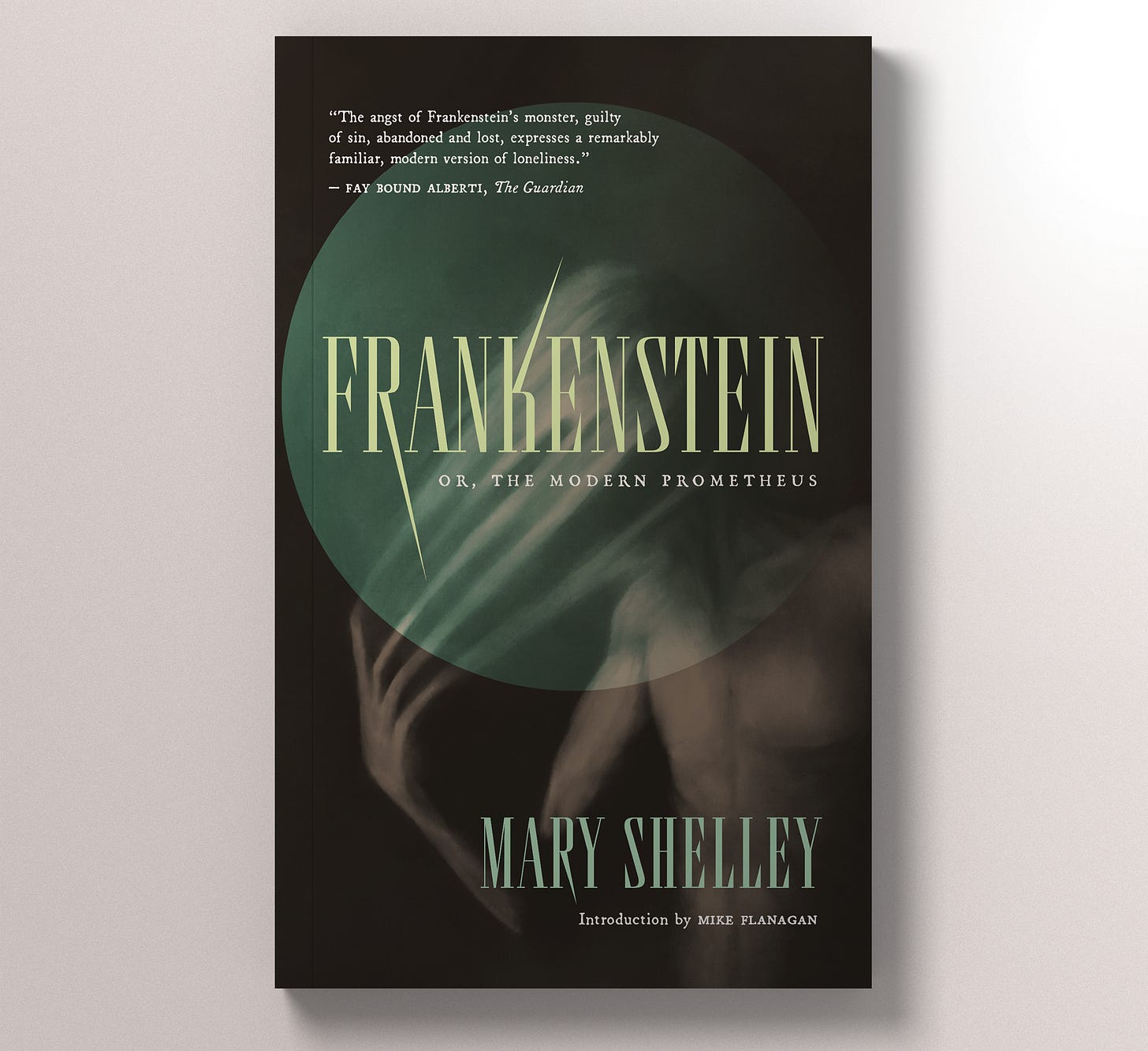
Happy Halloween, boils and ghouls! I come to you with the residue of multiple halloween costumes past still on my eyelids (glitter) and in my hair (tip: two-wash hair dye is in fact five-wash hair dye). I adore this hallowed holiday, and will continue to observe it by participating in candy-clearances sales for days to come. I’ll keep today’s post short and sweet scary: with the arrival of Guillermo del Toro’s new adaptation of Frankenstein in theatres, I thought this was the perfect occasion to round up a few of my favourite Franken-covers.
This time last year, I was participating in a book design course taught by the wonderful Ingrid Paulson, and we were all invited to craft our own covers for Mary Shelley’s classic (I’ll post mine at the end of the round-up). Since then, due in large part to del Toro’s adaption, several beautiful new covers have entered circulation. Let’s have a look!
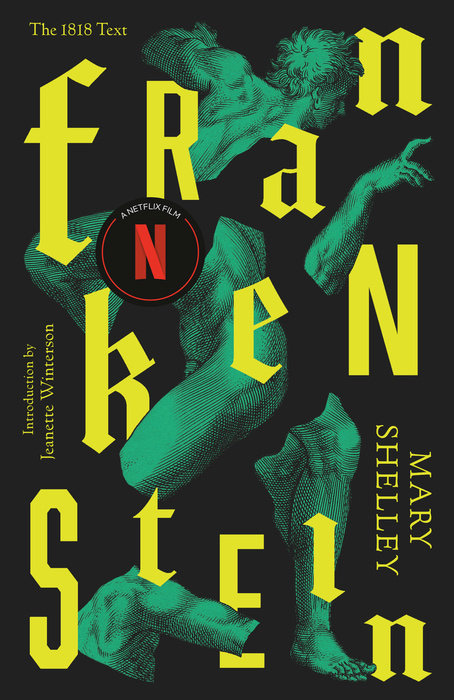
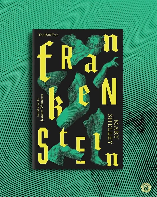
First up: Oh! Be still my artificially-revived heart! This new design by Perry De La Vega debuted in August (see lovely instagram graphic below). The reaction to the cover was swift in adoration, followed by an equally swift turn towards anger when people began receiving their copies with a pre-printed on Netflix sticker. Thankfully, while the pre-printed sticker appears to be a new industry standard, this fabulous cover is stunning regardless. I’d love to have this on my shelf.
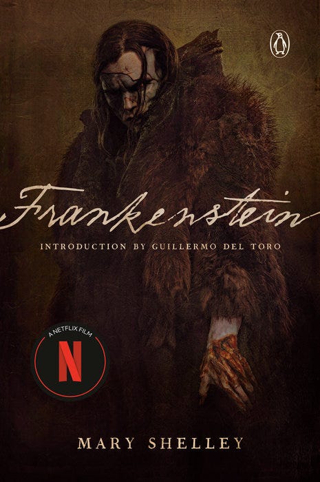
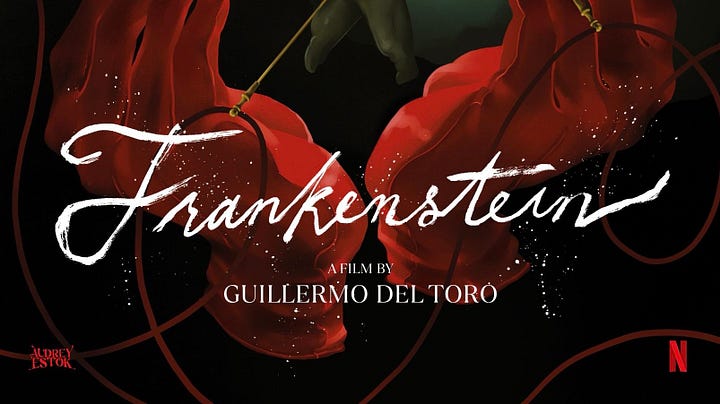
Let’s stay with Netflix a minute longer and assess the official movie tie-in cover. For creatives and designers alike, the spookiest thing we’re facing is the ever-growing acceptance of AI in creative practice. Director Guillermo del Toro’s righteous and inspiring fight again AI is a light in the dark. He says:
“I want real sets. I don’t want digital. I don’t want AI. I don’t want simulation. I want old-fashioned craftsmanship. I want people painting, building, hammering, plastering.”
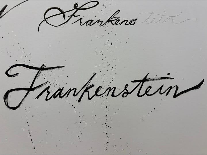
That's exactly what’s on display in this cover. Jacob Elordi is somewhere under 50lbs of FX makeup. The title script isn’t a ripped DaFont font, it’s a custom calligraphy from artist Audrey Estok. Movie tie-in covers are rarely a collector’s item, but GDT has managed to buck that trend too. No tricks, just a treat!
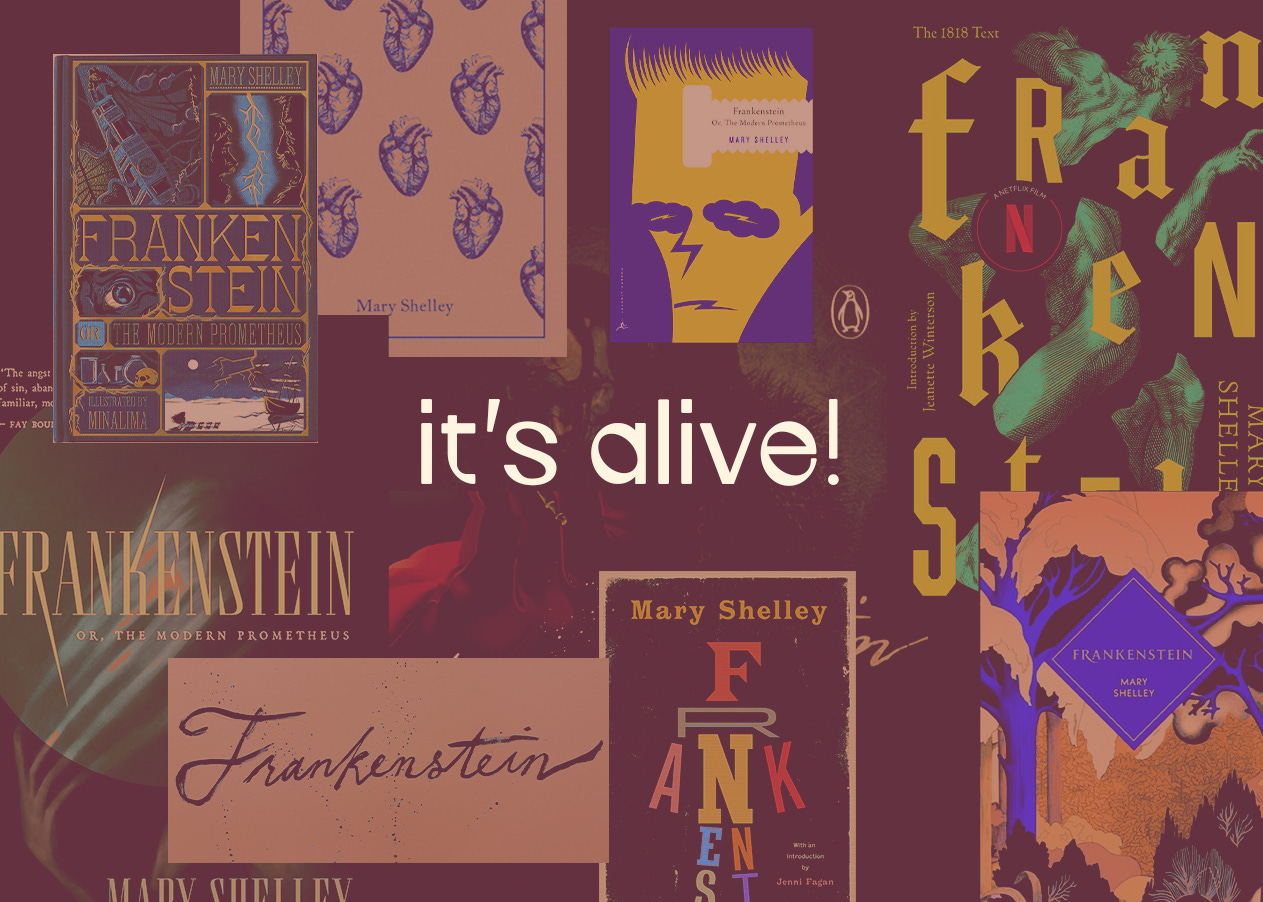
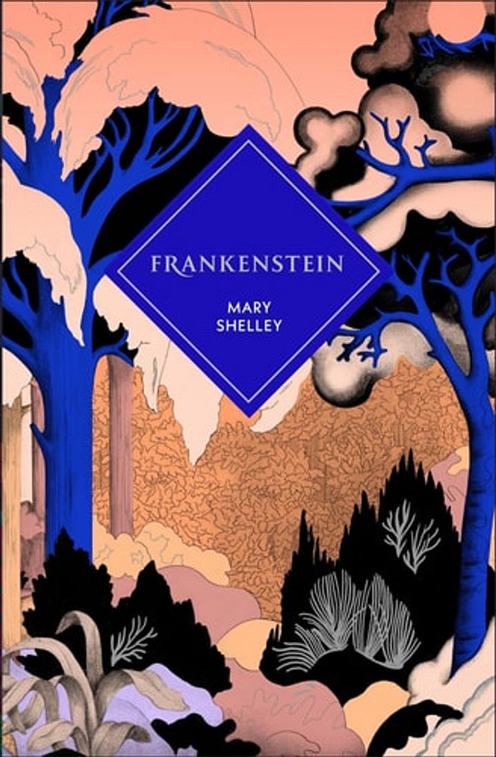
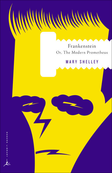
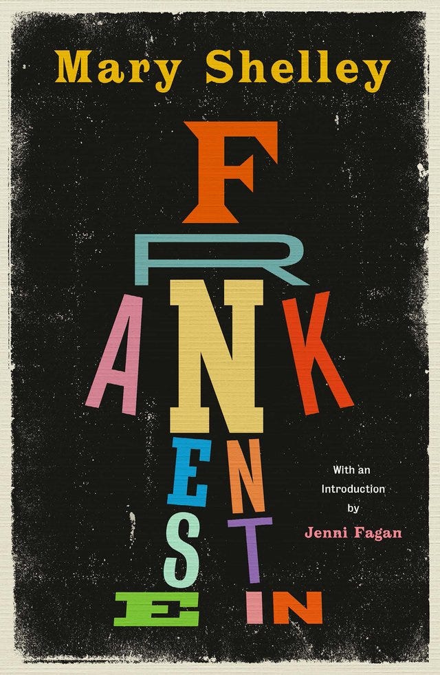
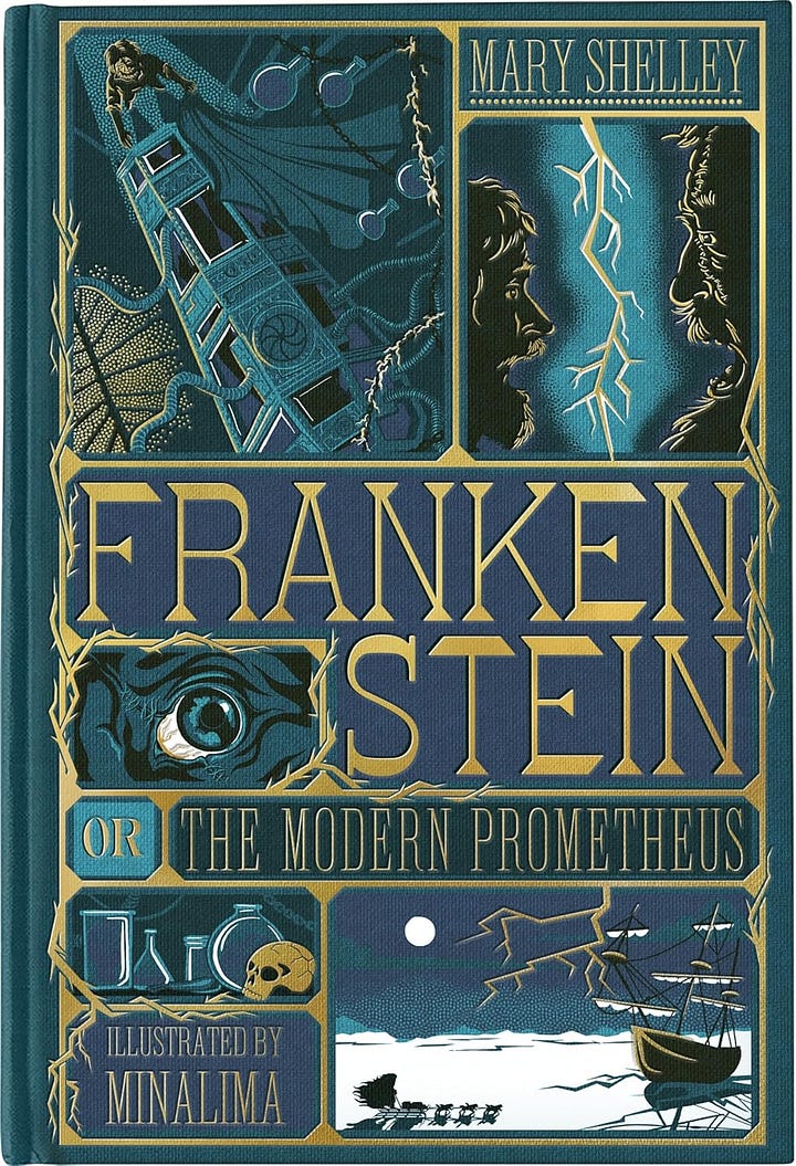
I’ll move more quickly through these next few selections. I just want to point out the delightful diversity in approach. Midcentury rainbow type! Restrained minimalism! Textured graphic-novel panels from design duo MinaLima! I read Frankenstein last year for the first time, and was blown away by its relevance and depth. There is something in the story for every kind of reader, and there’s a cover for any collection. Click through:
I’ll close out this post with my own foray into Frank-dom. When designing this cover, I wanted to capture the yearning at the heart of story. I connected with this image because it felt deeply emotional whilst being spectacularly spooky and unsettling. I kept the type choices rooted in the historical context, and diluted the classic Frankenstein green to an aged seasick sea foam. I hope Mary Shelley would approve!
Wishing you all a wickedly wonderful day. Eat a Reese’s for me, and GO JAYS!


