

Just My Type
New releases with big, juicy type

Greetings, type lovers, font nerds, and Microsoft Word-Art heads!
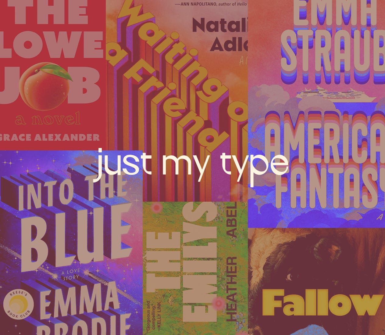
It happens to be a big pub week for a few spring books high on my TBR, and once I noticed what they had in common, I knew it was the right time to compile a few of my favourite 2026 type-based cover designs. Bold, brashy type is all over the new release lists, and I hope you’ll join me in applauding these audacious letterforms.
Let’s start with the Emmas! Emma Brodie and Emma Straub both have big-hearted contemporary novels out this week, with big-impact contemporary type-based covers:
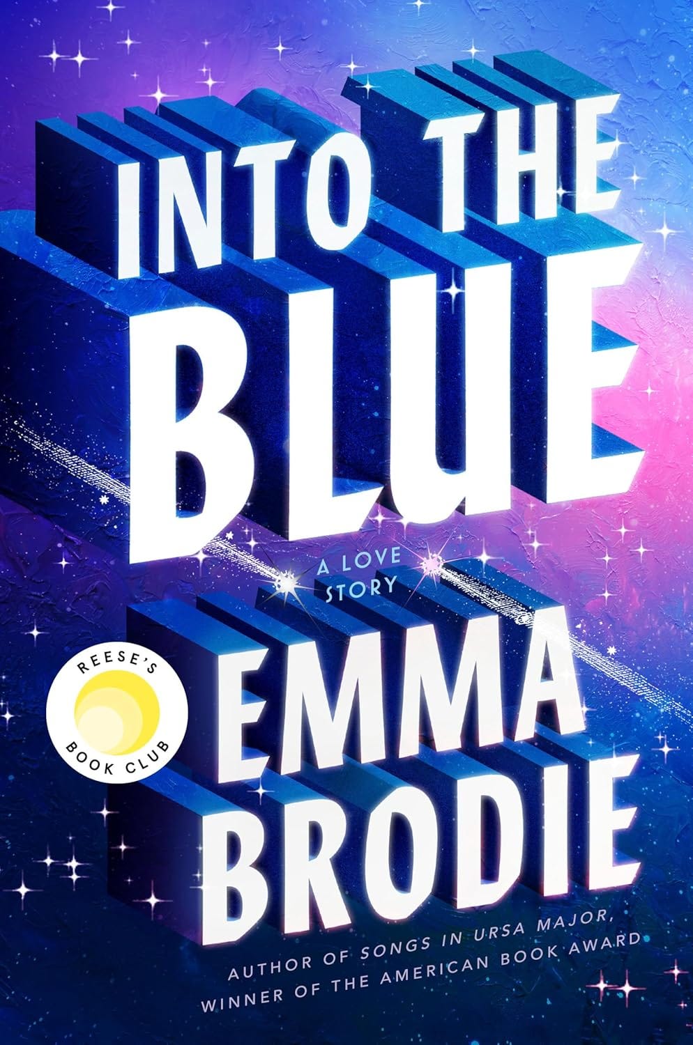
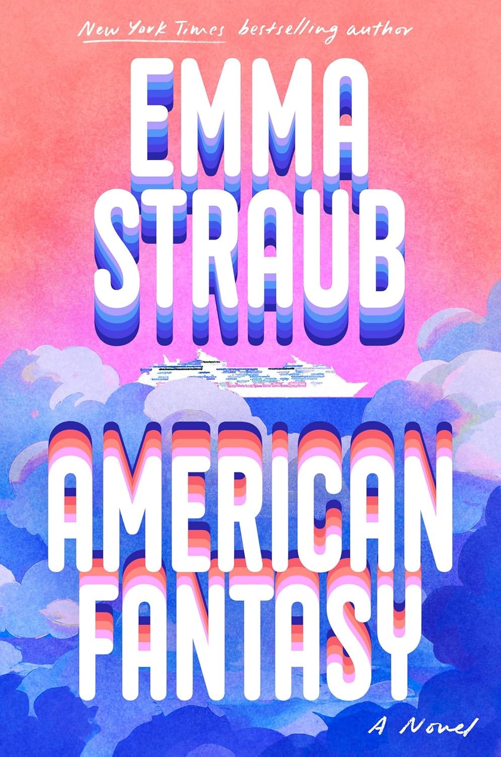
How good do these look together??? Rich blues and pinks, ethereal skies, and dramatic 3D type make this a perfect pairing. Cassie Gonzales Vu designed the cover for Into the Blue, pitched “An epic, decades-spanning love story that blazes through the worlds of acting and comedy and charts a connection unlike any other.” American Fantasy’s cover is the result of a beautiful union between type queen Jessica Hische and Vi-An Nguyen. All I’ve heard about American Fantasy is “boy bands” and “cruise,” and that was enough right there. Immediately sold.
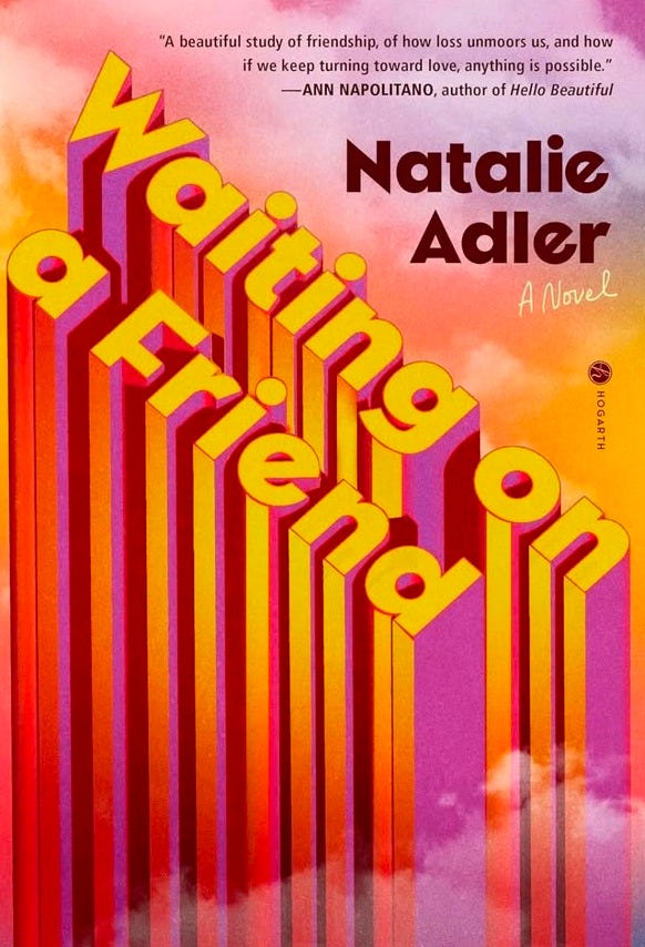
It wasn’t a surprise to discover that Cassie Gonzales Vu is also the designer behind another cover on my list, Waiting for a Friend by Natalie Adler. Vu takes the 3D type to its extreme with this cover, turning it nearly on its head. This story follows a queer woman in 1980s NYC, who just so happens to see ghosts. I love that the type brings to mind skyscrapers in the clouds, but as soon as you read the synopsis, the clouds take on an ephemeral, ghostly quality too. There’s a great read-up of the cover design process here if you’d like to read more!
That’s it for the 3D type, so let’s take a quick gander at some wonderfully chunky type that’s caught my eye lately:
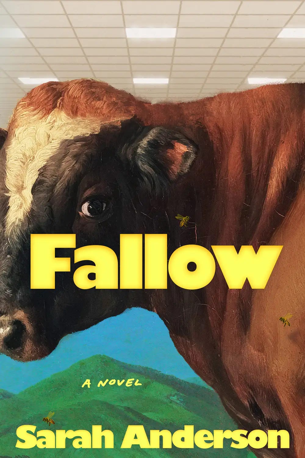
Obviously the cow is the star here, but a moment for that ultra-bold Chantilly! It’s delightful and strange, and almost seems to glow under the din of office overhead lighting, c/o the team over at Rodrigo Corral.
This next pick corrects the omission of this gorgeous green cover from my key lime green round-up a few months ago, Elena Giavaldi’s beautifully crafted green cover for Heather Abel’s new novel The Emilys:
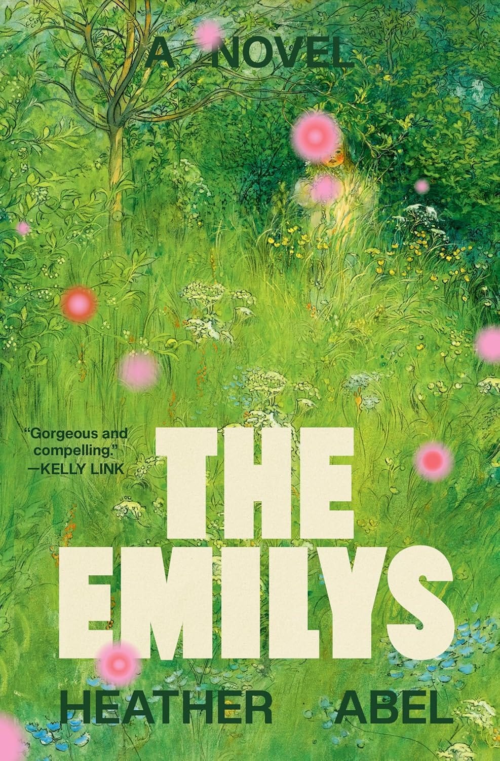
She tells Electric Lit, “the design had to feel lush, green, and inviting, but also a bit off—slightly eerie, with an edgy quality,” and the inclusion of this heavy-but-soft type really strikes that balance.
Last one! Emily Mahar really went for it with this raucously fun cover for The Lowe Job (side note: just realizing now I really could have made this an exclusively Emma/Emily-themed roundup):
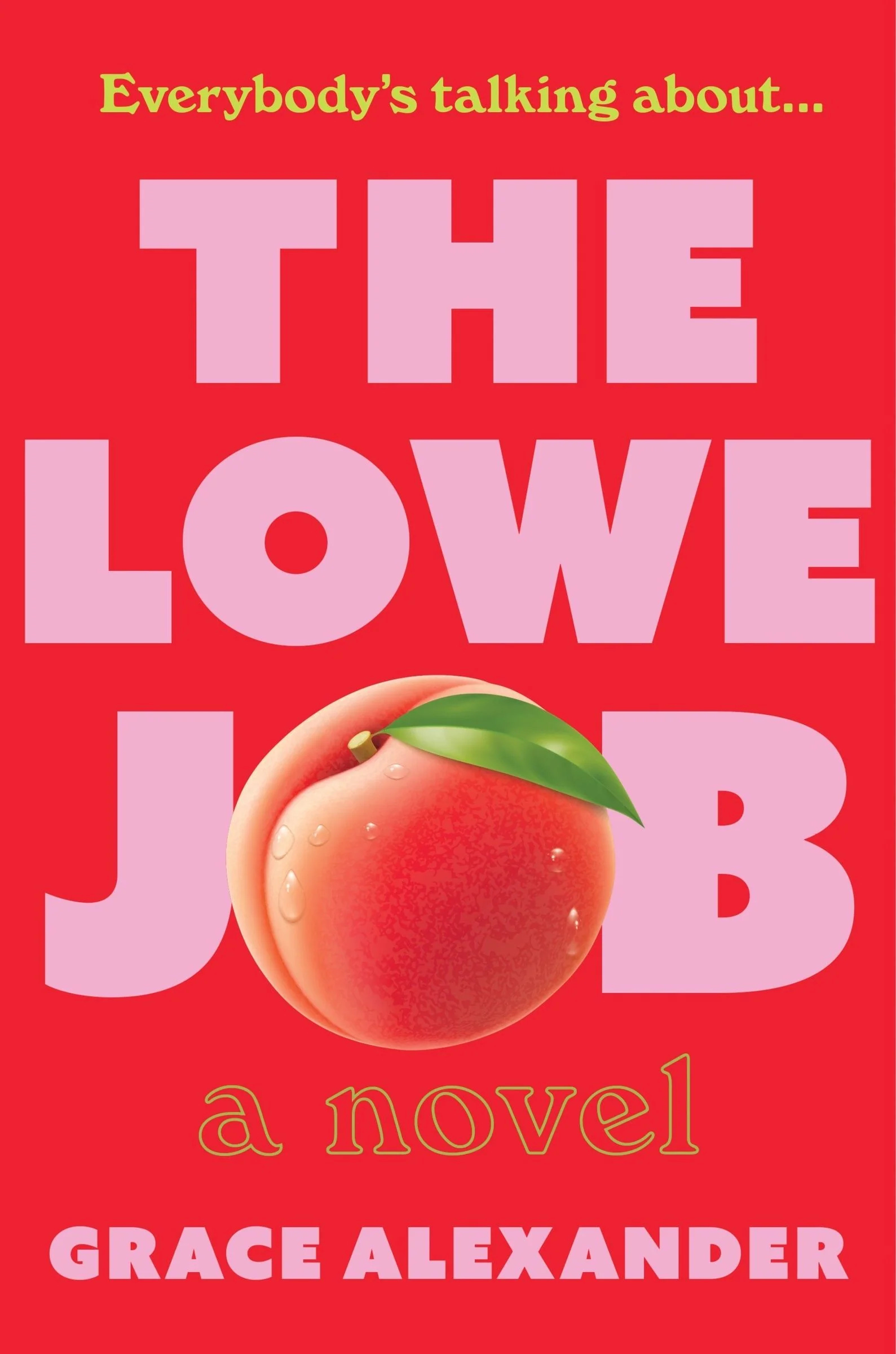
Sometimes, a cover calls for subtlety and a light touch. This was not one of those times. This cover says everything it needs to, very loudly, and I think it’s perfect!
Let’s end it there! May your type be juicy, and your peaches even juicier,
-Julie
I love looking at book covers through your eyes! These are all 🤩🤩🤩