

Simply Sublime
Nature, beauty, and awe in this cover trend round-up

I want you to take a walk back with me to the year 2007. I’m 20 years old, in my third year of a liberal arts degree, currently discussing with my roommate if we should go tanning after class. And maybe we can watch America’s Next Top Model later? The class in the way of our tan-and-Tyra evening plans is 17th Century Literature. It’s with my favourite professor, but, admittedly, I find it a little dry (hard to penetrate brains that are probably preoccupied with wondering who, between Paris Hilton or Lindsay Lohan, will do more jail time.)
This 2007 classroom is the personal and cultural context in which I discover Sublime is not just Long Beach’s best ska reggae band. Because in today’s class, I will learn another definition of sublime. The sublime, in the context of 17th century literature and art, is a feeling of overwhelming grandeur.
…of awe,
…of beauty,
…of menace!
It is an ineffable sense of our smallness in the world. It is a greatness our minds may not ever be able to comprehend. To ponder it is to attempt to stare straight into majesty itself, and feel it bore back into your VERY SOUL!
Ummmm ok?????? Class dismissed!
I’m taking you down this walk through memory lane, because in a sea of often forgettable academic experiences, I still vividly remember opening up this portal. It was a door blown straight off its’ hinges.
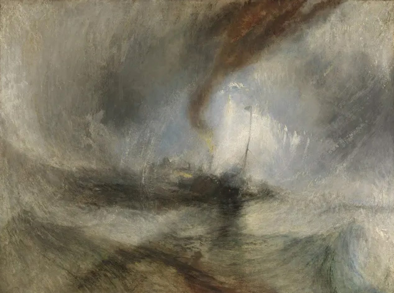
While I can’t recite any Wordsworth, or recall even a line from “The Rime of the Ancient Mariner," I can still spot a J.M.W. Turner painting at the thrift store. Turner’s artwork gave me a visual language for these overwhelming concepts. Turner’ s dramatic landscapes and seascapes, so infused with romantic light and terror, remain truly timeless.
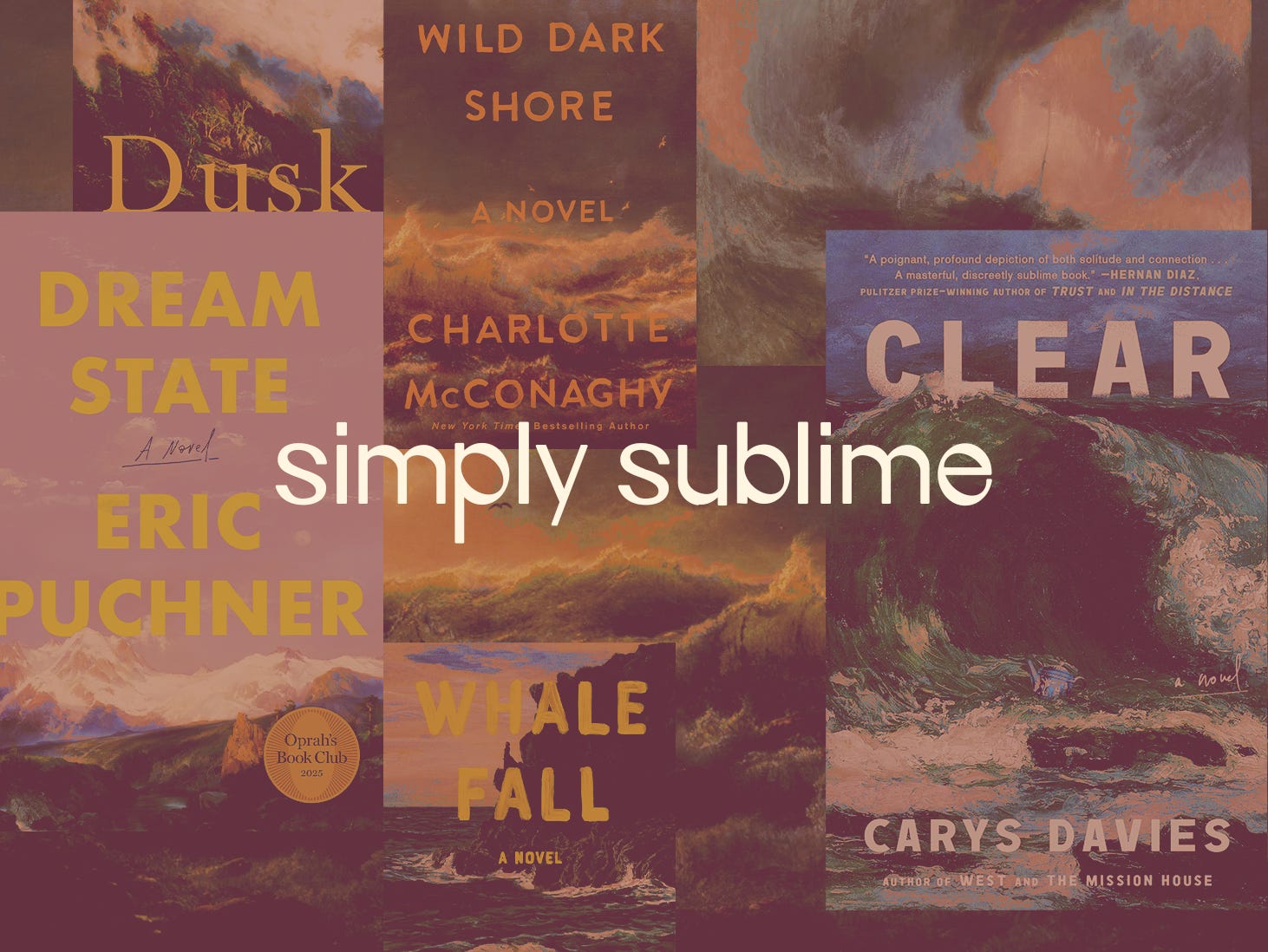
And so, in the 18+ years since I first encountered the sublime, tanning beds are the thing of the past, but images like Turner’s are returned to again and again. Over the last year, I’ve noticed several stunning book covers that use similar grandiose landscapes as their launch pad - not always Turner, and not always from the 17th century, but the same sense ephemeral and atmospheric awe. I’ve made it today’s assignment to share a few of my favourites with you.
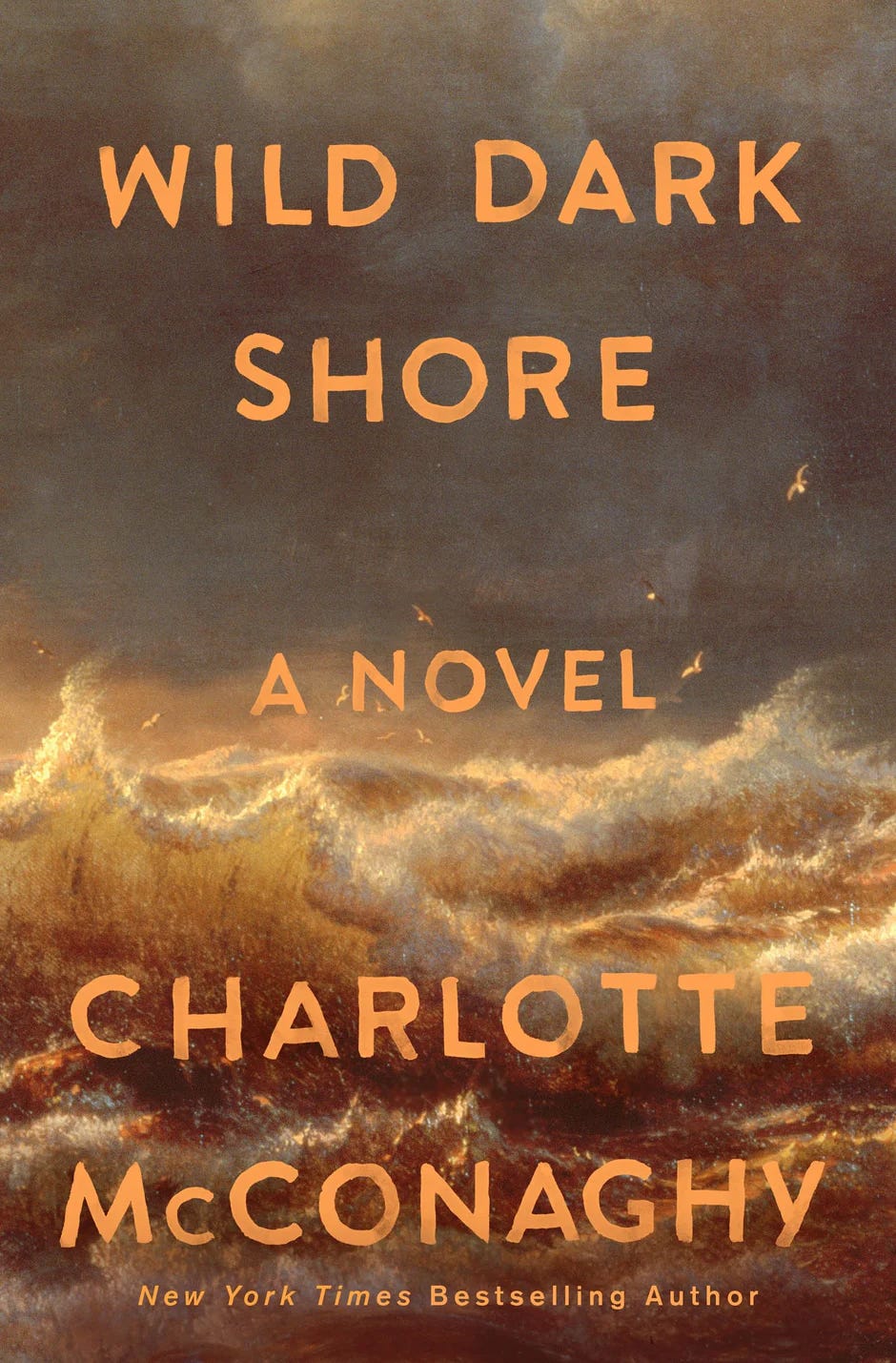
Of course I had to start here. Wild Dark Shore was a major book of the moment in early 2025, and having read and loved it, I think this cover absolutely does justice to this wallop of a story. Cover designer Keith Hayes uses a Andreas Achenbach painting from 1847.
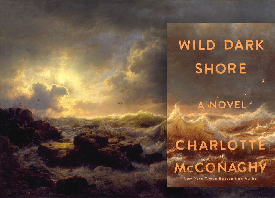
But he didn’t just crop the original work: he resaturates the piece, landing it in a scheme of rust and copper. To me, this perfectly fits the themes of decay in the story. Paired with a choppy but not a all precious hand painted type, it works beautifully.
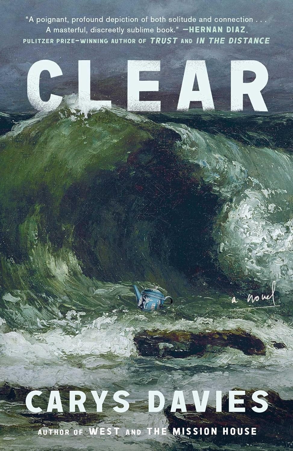
Let’s stay in the tumultuous waters and take a look at Tristan Offit’s cover for Clear by Carys Davis. I love the interaction between the title and the wave! But the real star of the the show here is that strange little teapot. What it doing there? Does the plot summary give us any clues? “On a remote Scottish island, Ivar, the sole occupant, leads a life of quiet isolation until the day he finds a man unconscious on the beach below the cliffs.” I’m now convinced this would be a perfect compare and contrast read with Wild Dark Shore. Have the essay on my desk on Monday, please!
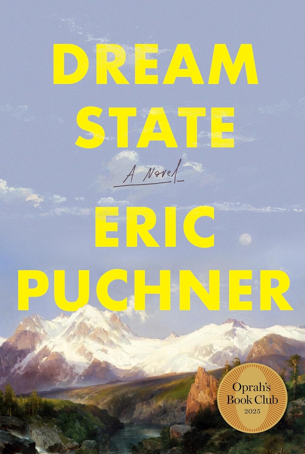
While the last cover interrupted the feeling of the sublime with a teapot, this one does it with brash yellow type. I love the juxtaposition of the modern sans with the classic oil painting underneath. I was able to track down the original painting (“The Teton Range,” by Thomas Moran, 1879), but alas the designer remains a mystery! I just saw this one on the shelf at my local book store, so I’ll go back this week to confirm.
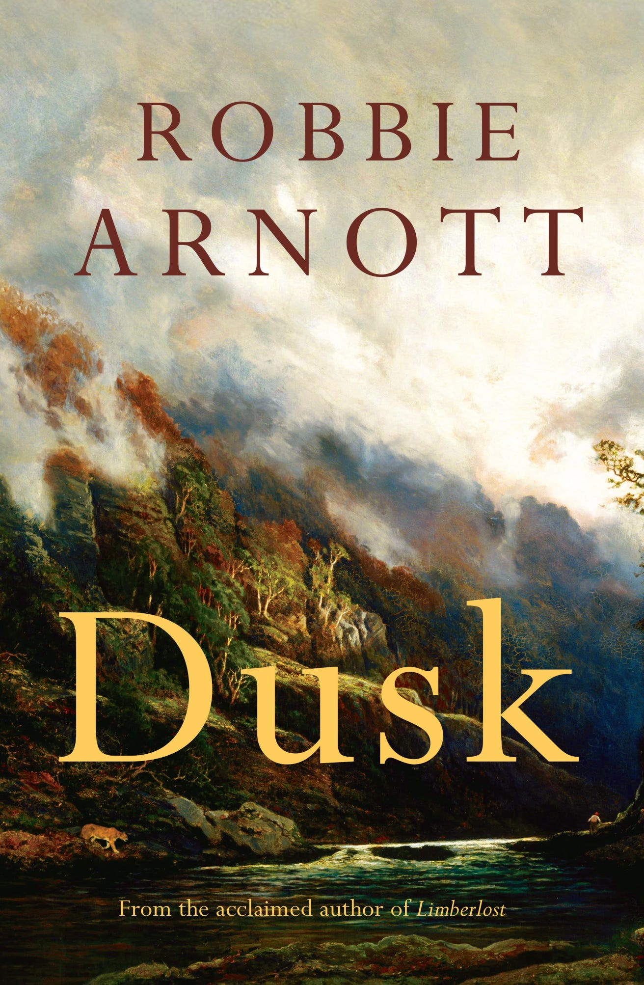
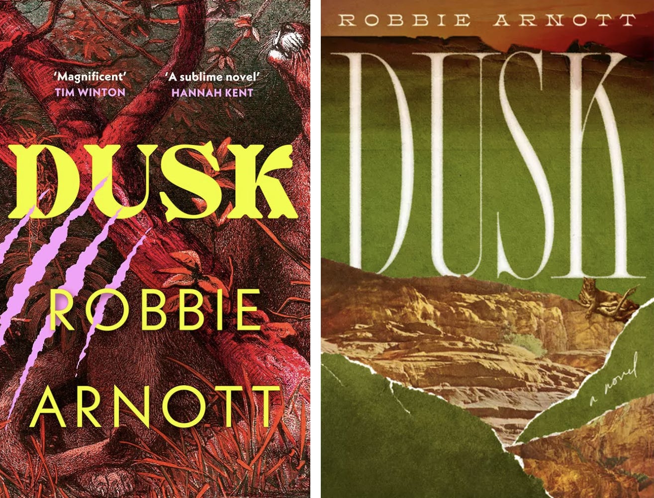
I’m going to end with this stunning cover for Robbie Arnott’s Dusk. I think this cover is especially interesting when you contrast it to the other two (also very good) covers in circulation (below). The novel centres around two twins hunting a dangerous puma in the rugged, ancient landscape of Tasmania. The covers below focus in on the threat of the puma, with violent claw marks and ripped edges. The cover above lets the puma get overshadowed by the vast mountain scene. Perhaps suggesting the true danger is the environment itself? I think my old friend Turner may agree.
I’ll leave it there for today! Thanks again to everyone that’s subscribed so far. It’s a delight to geek out with you. There aren’t too many people that would stay with me from Tyra Banks to J.M.W Turner, so I promise I won’t take you for granted. <3